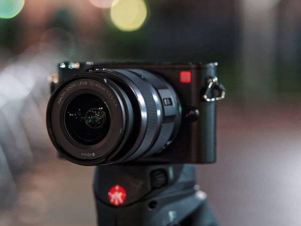
New entrants to the photography industry are few and far between. Even just a current player entering a new market segment, like Fujifilm recently entering the medium-format market, creates a huge buzz. So you can imagine how all eyes were on YI when they announced their entrance into the photography market with the YI M1 mirrorless camera. And it was definitely an entrance meant to grab headlines, promising a fresh new take on camera user interfaces and more smartphone integration than any mirrorless camera before it, plus excellent image quality from a proven Sony 20mp sensor.
The YI M1 looks especially intriguing for nighttime photographers, as its heavily touchscreen-based interface could be especially advantageous at night. With just 4 buttons (including the shutter release) and 2 dials on the entire camera body it should be easy to remember how to operate in the dark when you can’t see any labels – most functions are controlled through the touchscreen, which is unaffected by low light.
And after testing the YI M1 for over a month, the word that keeps coming back is “quirky”. This camera does things much differently than cameras we’re used to from established manufacturers: the quirks go far beyond the unique touchscreen interface. And while some of them were fun or interesting, unfortunately others ended up being annoyances or shortfalls. In the end, that made the YI M1 a niche camera that provides excellent value for some photographers, yet is unable to meet other photographers’ needs. To help you decide if it’d fit your style, here’s an overview of how the YI M1 works as a nighttime-use camera.
Interface
As mentioned earlier, the headline feature of the YI M1 is its interface, which looks promising for nighttime use: the YI M1 has just four buttons (a playback button and control button on the back, plus the shutter release and video record buttons on the top), and 2 dials (a mode dial and a control dial on the top), relying on its backlit touchscreen, which is easily visible in low light, for most operations. In theory that’s a lot less buttons to have to memorize, and a lot less feeling around the camera in the dark picking out the right button or dial.
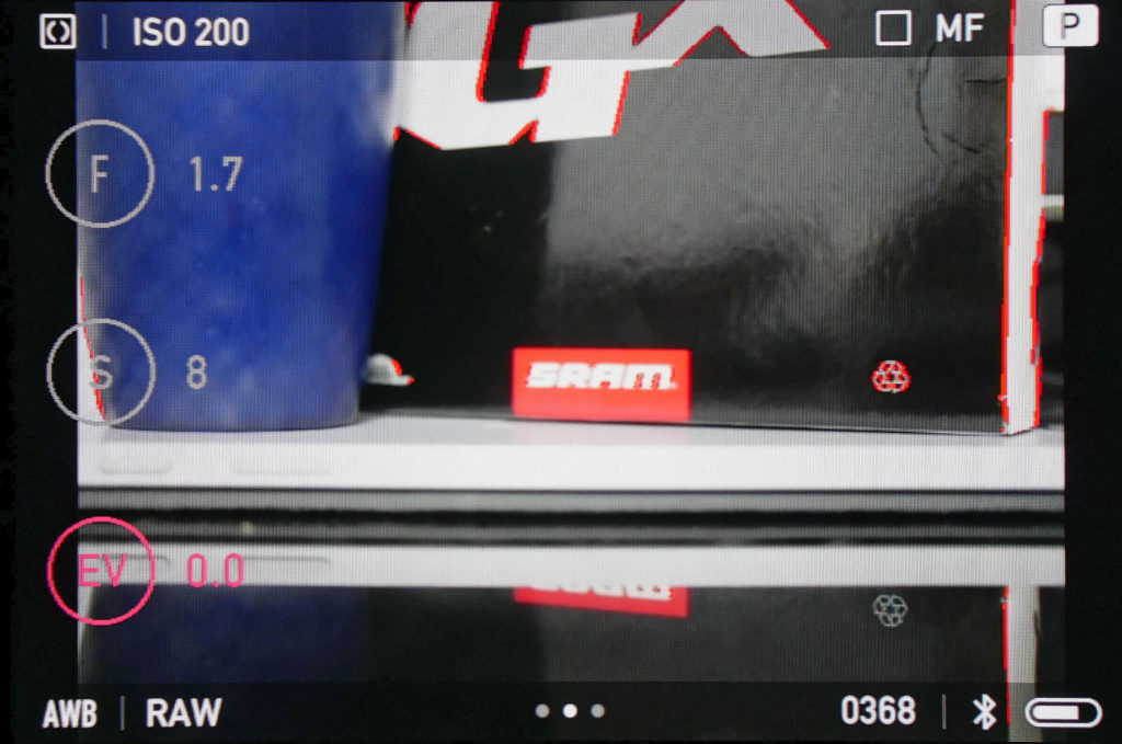
On that touchscreen, the aperture (F), shutter speed (S) and exposure compensation (EV) settings are permanently shown on the left of the screen:
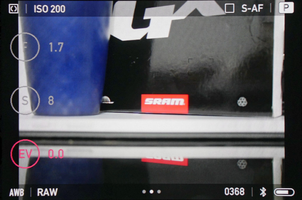
In P mode only exposure compensation can be controlled, as shown in the above screenshot, but as you switch between P, A, S, and M modes the correct settings become available or grayed out. To adjust a setting, spin the top control dial. Whichever of the three settings is red is the one currently being controlled by the dial, and to switch to a different setting, just tap on its circle.
The camera defaults to multi-point autofocus, but to select a single focus area, tap where you want to focus on the picture:
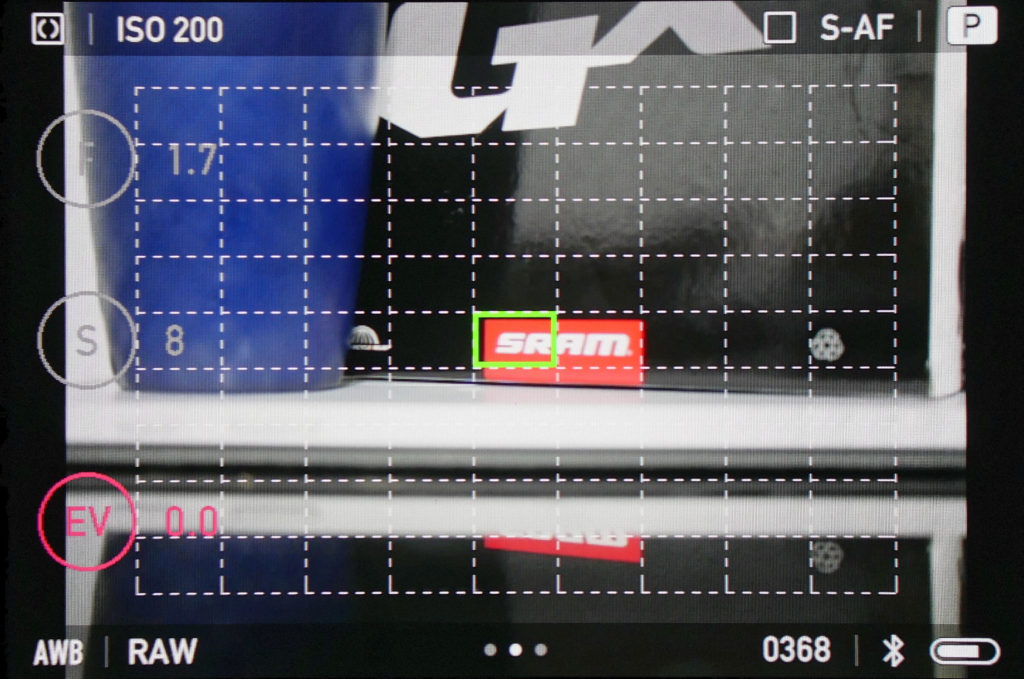
To go back to multi-point autofocus, press the control button (the circle) on the back of the camera. Single and multi-point appear to be the only focus zone selection options on the M1.
Swipe left to go to the menu, where you can adjust the cameras’ settings. Tapping one of the squares will either toggle it on or off, or bring you into a submenu, depending on what you tap:
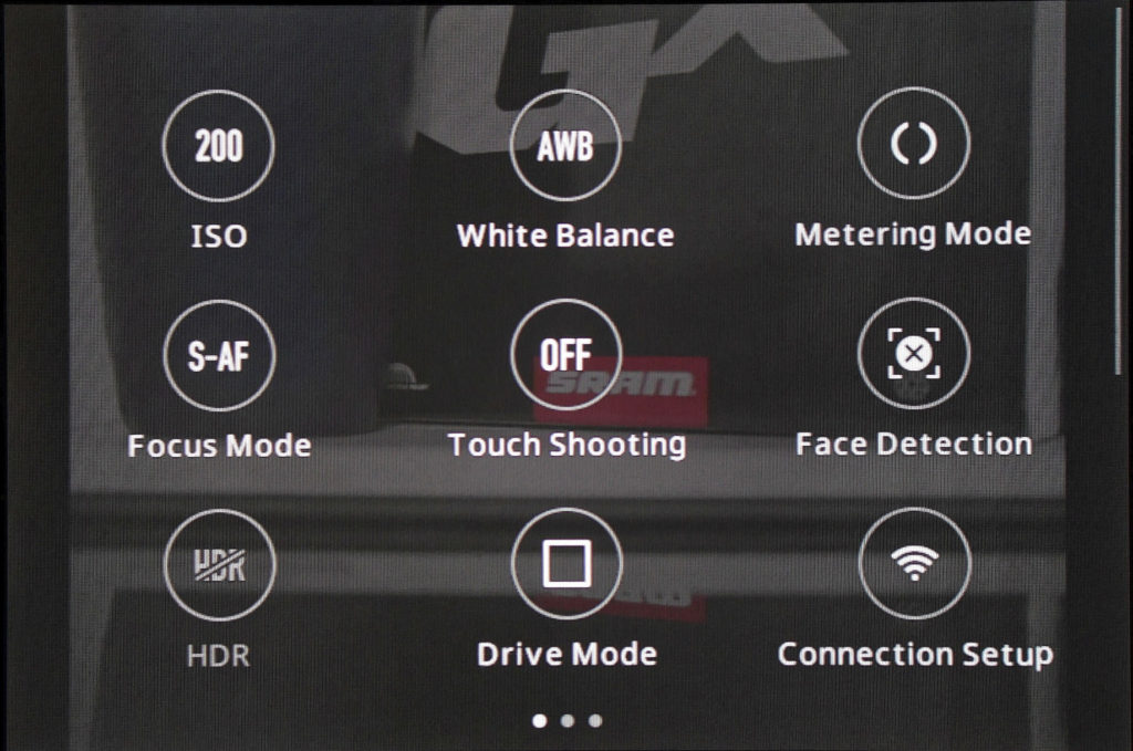
That’s the basics of how to shoot with the YI M1. So what’s it feel like to use?
Use
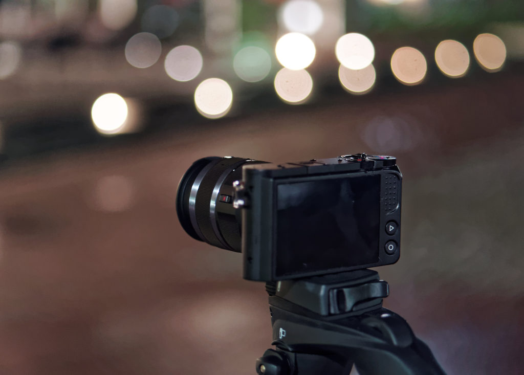
The YI M1 feels like it was meant to be used a specific way. And if you stick to adjusting the settings that it seems like you’re “supposed” to change, the shooting experience is practically seamless: switching between and adjusting the big 3 (shutter speed, aperture, exposure compensation) is quick and easy with the big touchscreen buttons and the control dial. Similarly, it just takes a tap to select a specific focus point, and a single button press to switch back to multi-point autofocus. Using the YI M1 like this is easy and fun, too: the way you adjust shutter speed or aperture harkens back to the cameras of old, albeit with a modern touchscreen twist.
However, things get more complicated if you stray past those settings. Most notably, to adjust ISO, a key setting for night photographers, you need to (1) swipe up to enter the menu, (2) swipe left to get to the second page of the menu, (3) tap on the ISO button, then finally, (4) select your desired ISO. In daylight this isn’t much of an annoyance, since you typically keep your ISO at minimum. But changing ISO is an important way for night photographers to extract maximum performance out of a camera, so having to do this 4-step routine repeatedly can get frustrating, especially as you move through changing lighting conditions. Changing other “secondary” settings, like white balance and metering, also requires going into the menu, and there’s no way to set a shortcut for any of these.
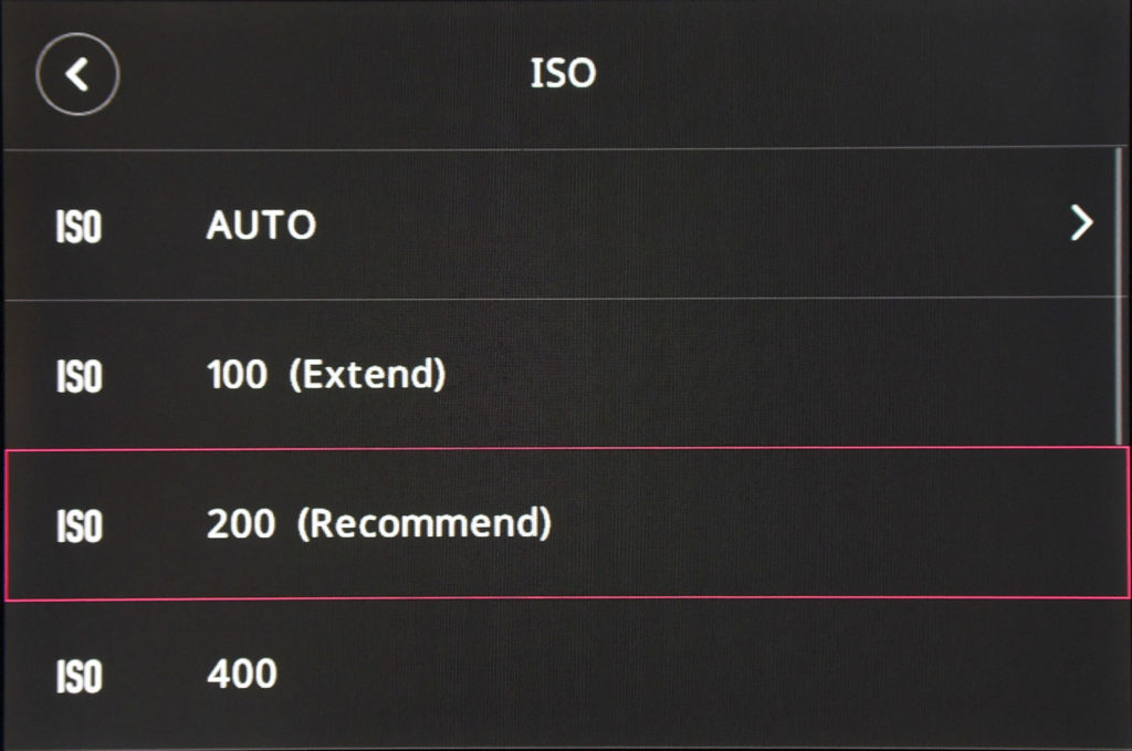
Taking a minimalist design approach can definitely make something easier to use, but when taken too far it becomes a hassle again. Depending on how often you adjust settings outside the big 3 and autofocus, you may be spending more time in the YI M1’s menus than you’d like to.
On a brighter note, the YI M1 is snappy and responds to inputs with unnoticeable lag. It also turns on reasonably fast, and there’s a nice, crisp click on shutter release.
Performance
Performance was an area YI was relatively quiet about in their press materials. Camera manufacturers have historically waged war over the accuracy, speed and precision of their AF and metering systems, constantly coming up with new technologies and algorithms to gain an edge. But as can be inferred from their lack of participation in any of this, the YI M1’s performance capabilities are relatively basic. That doesn’t necessarily mean bad news though – this is 2017 and every camera today is miles ahead of anything from a decade ago (and we got by just fine back then).
Looking at metering first, after taking a few snaps with the YI M1 with automatic exposure, it’s clear that it has a tilt towards overexposure. This bias was welcome, though, as most cameras lean too far towards underexposure, leading to bland and tired-looking images. In contrast, the YI M1 produces bright and vivid auto-exposed images which look closer to edited images than most other cameras’ output. The downside to this, though, is that when you overexpose and blow out highlights like it does there’s less latitude to edit an image later. As a result, the YI M1’s files will be less editable in post-processing unless you compensate for this.
Autofocus is easy to control, as there aren’t any complex multi-zone or active zone selection modes, and performance is great when focusing on static subjects in good light. It’s not lightning fast and won’t impress anyone, but gets the job done competently. Unfortunately, it falls apart much sooner than other cameras as lighting decreases. In moderate (but not extremely) low light, like under a typical streetlight, the YI M1 will start cycling through the focus range and struggling to lock on. Go a little darker and it’ll start failing to lock focus or giving false positives. Aside from ISO control, the ineffective autofocus is the other major frustration of using the YI M1 at night. It’s not totally unusable, just unremarkable.
But if you want to try manual focus, the camera luckily has focus peaking and a magnified view (access it by pressing the circle button while in MF mode) that seem to work pretty well, although with a lack of customizability: the focus peaking can only be red and only had one sensitivity level which was relatively high, and for magnification you only get 2x or 4x.
Shot-to-shot speed was also a point of frustration: in single-shot mode, it doesn’t seem like you can load the cache with more than one photo at once. Instead, you have to wait for the previous photo to completely finish writing before taking another. And in continuous shooting, you get a quick, short burst of 4 (RAW) or 5 (JPEG) images, then further images take up to a second or more. The LCD screen is also frozen throughout continuous shooting, until the images finish writing.
Build Quality
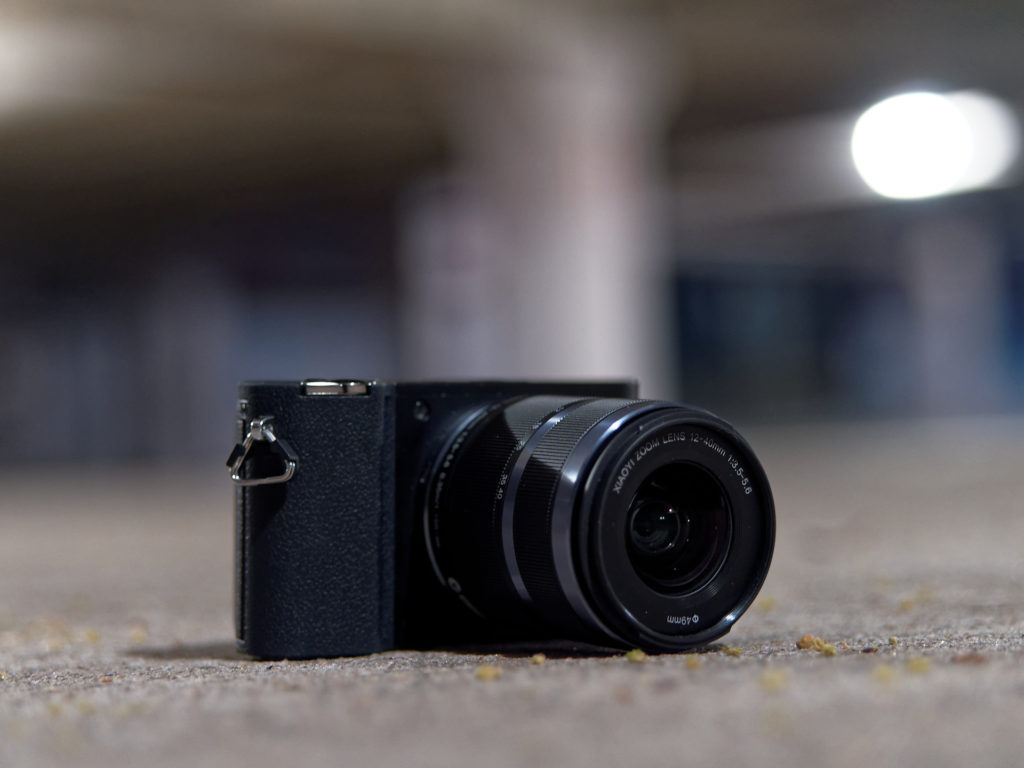
The YI M1 is unashamedly plastic. But it’s a high-quality plastic that feels solid, thick and sturdy, with a rugged speckled finish. Gaps between panels are small, the rubber of the grip feels nice and durable, and there’s nothing to complain about with the buttons and switches – all work great, with little play or looseness. The camera body feels much more like a professional tool than a toy – exceeding expectations for its $349 price point as of early 2017. Build quality is similar to that of a DSLR, which you honestly can’t say about many other entry-level mirrorless cameras (most have build quality resembling that of a point-and-shoot). One knock against it is that it isn’t weather-sealed, but aside from that, it feels durable enough for heavy and demanding use.
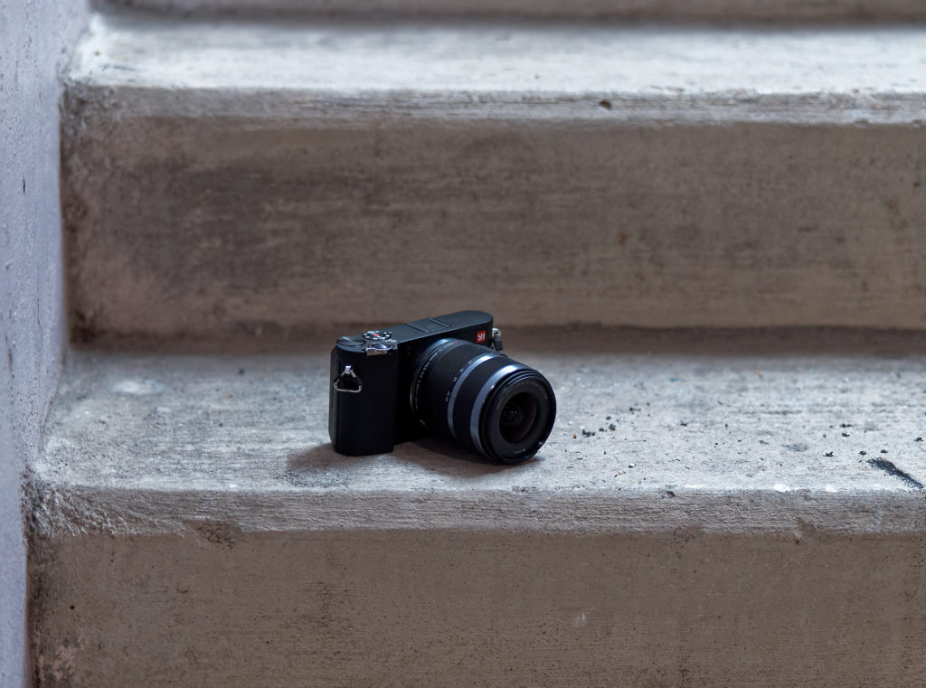
The kit lens, unfortunately, isn’t up to par with the body. It uses lower quality plastics (including a plastic mount) and feels light and a little flimsy, although truly not too far off what you’d expect from a kit lens. The lens body, especially the metallic accent parts, look like they would show scratches easily. On the bright side, there’s nothing to complain about with the action of the zoom or focus rings, and its image quality is right up there with comparable Micro Four Thirds kit lenses from Olympus or Panasonic.
Summary
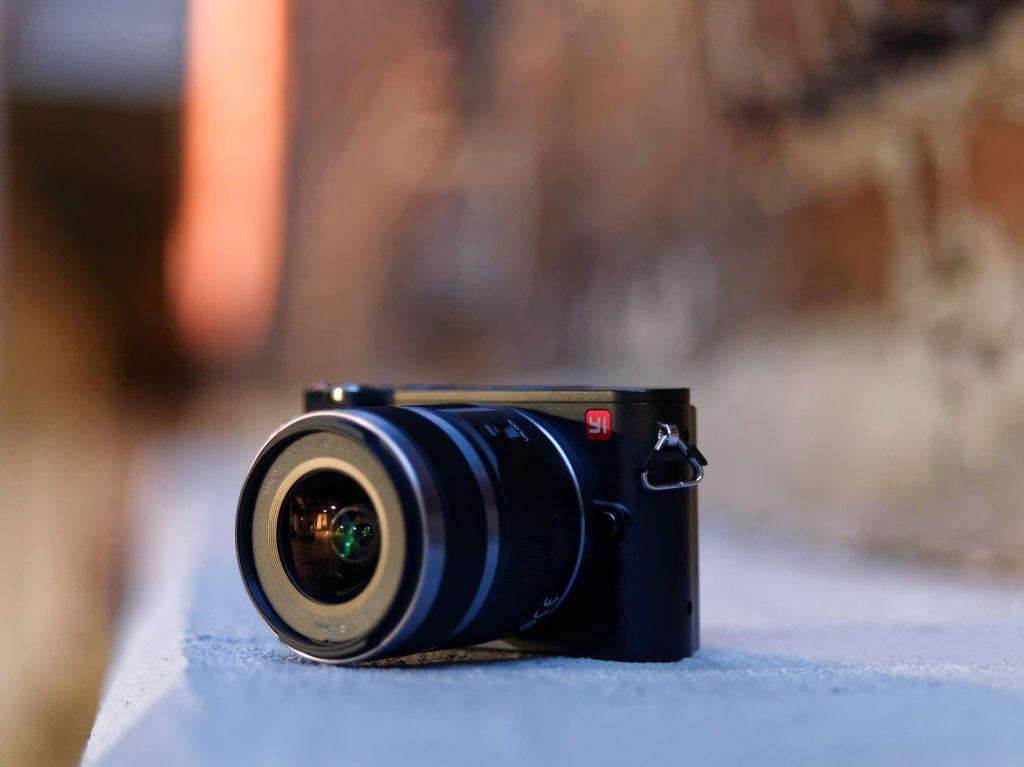
The YI M1 was fun and exciting to use. It really was. In a way, it felt a little like picking a camera up again for the first time. Its direct control of aperture and shutter speed made using it seem a little like using an old film SLR with physical aperture and shutter speed dials. This control mechanism, along with the minimalist menu system and overall interface, means the YI M1 feels more like a back-to-basics photographer’s camera than a techie’s camera — a camera for people who want to go out and have fun taking photos, rather than tweak settings. The solid build quality backs up the “photographer’s camera” assertion as well.
Yet, this is where the YI M1 gets a little confusing. Other attributes it has, like the tilt towards overexposure in the metering, and the “Master Guide” mode, suggest that YI was aiming at beginners stepping into photography for the first time. There’s a little bit of a paradox between how easy & fun it is to use the YI M1 manually, and how much it tries to be beginner-friendly. However, there’s nothing wrong with appealing to multiple populations in one camera. The camera’s performance, though, is what most holds it back from appealing to any population. Sluggish autofocus and slow shot-to-shot speed became frustrating, even just when shooting static subjects. Add on top of that needing to go into the menus to change anything but the most basic settings (most notably, to change ISO), and it became hard to enjoy using the YI M1. It’s definitely not an all-around camera that can fit in to any type of shooting.
Still, it’s hard to forget how fascinating it was to use the YI M1 for the first time, and there are some photographers who would certainly be happy with it. For example, if you do most of your photography outdoors in daylight, the autofocus should be able to serve you well, and you won’t be needing to pop in the menu to change things like ISO and white balance as much. Similarly, if you have a slower shooting pace and/or like to shoot on a tripod, being able to take the time to manually focus lets you avoid autofocus issues, and the slow shot-to-shot speed won’t interfere with your flow either.
Above all, the YI M1 is a fantastic start, even if it’s not a fantastic camera. YI’s future is bright because they designed a product that’s deeply unique — not just unique on the surface. And they checked a lot of the right boxes with the M1. Hopefully they’re already compiling feedback and figuring out what their next camera needs to look like.

